Big Banana Border

size: 36" x 44"

From a local Freecycler, I got a bunch of fabric pieces; they looked like sales representative samples in that they measured 13" x 17", all in the same line but different colorways and companion prints. They weren't anything that I would have purchased myself but certainly wonderful for charity quilts .. especially since the fabric was free. :-)
heh .. that sounds like the introduction to the other Crisis Nursery quilts, doesn't it? Well ... I'm still working from the same lot of Freecycle fabric .. and will continue for several more quilts. :-)
I was really getting into the zen of doing interesting layouts for these crisis nursery quilts. The first quilts I did for them were BIG chunks of fabric which made for fast and easy quilts, but they just were NOT interesting to look at. After I made a bunch of them, I began to feel somewhat guilty about taking the 'fast and easy' route and resolved to make some quilts that looked prettier.
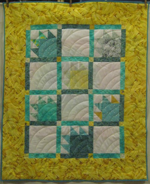
These Bear Claw blocks have always been a favorite of mine. I think they just look so cool. :-) Trying to optimize the size of the Freecycle fabric the best I could, I was made the 'claws' of the Bear Claw from different but coordinating fabric than the body of the block.
The horizontal grid layout is certainly a tried-and-true design but not necessarily the most interesting. To add some zing to it, I put contrasting squares at all the intersections. Also, you don't notice until it's pointed out, but I placed the same fabric in the sashing so that it forms a Rail Fence pattern. Scroll back up to the big photo at the top of the page and you'll see what I mean. Heh .. you'd think I was excessively clever or something. [grin] In reality, I don't do random well. I want to micro-manage it. It was just easier for *me* to place the sashing fabric into a pattern of its own rather than attempt to do a nice looking 'random'! So, it wasn't clever at all .. it was just me being lazy. :-)
This resulted in a decent sized center medallion but not nearly big enough for the nursery's minimum size. To pump it up, I found the last piece of Big Banana fabric that was absolutely perfect for the border! I have to smile every time I see that fabric .. it's just so cheery. Who can resist a Big Banana? :-)
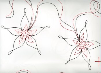
 I wanted a rambling, meandering sort of design for the borders and found one in an interesting quilting design packet I recently purchased. "More Twice-Quilted Designs" by Glorianne Cubbage is a packet of quilting designs from That Patchwork Place. The premise is that each of the included designs consists two parts. For example, a floral motif would have the inner details of the flower as one pass and the outer petals as the second pass. It is suggested that you do each pass in a different color for more impact. It's a very interesting approach. You could certainly do each design in just one pass, as standard quilting designs are done, but doing it two separate passes allows you to introduce color as part of the quilting design. In the design on the left, the two passes are shown in different colors so you can see what they are.
However, for *this* quilt, I chose to do ONLY the outer petals, shown in black. This is a small quilt; too much quilting will make it stiffer than I want. Also, the outer petals are fairly easy to do free motion ... there are 5 loopy petals; I thought of them as a head plus an arm plus a leg plus another leg plus another arm .. then some loop-de-loops to get me to the next spot for the next flower. That kind of image for forming the design made it easier for me to quilt them free motion. :-)
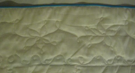
Here is the border ... front and back ... with just that outer petal quilting design. You can see that the busy-ness of the print obscures the quilting; another reason not to get too fancy. But when you see it from the back, the design is clearly visible. You can also see the swirly-curly design (from Carla Barrett's blog) I put in the sashing. By the way, Carla's blog has FABULOUS quilting designs, all very clearly drawn out and easily followed. I love her stuff! :-)


|
 Then came the quilting in the Bear Claw blocks themselves. For whatever reason, the idea of a Baptist Fan dug itself into my head and I couldn't get rid of it.
I really do like Baptist Fans but after stitching them, I'm not quite sure this was the best design I could have thought of (oh dear .. that's a horrid grammatical structure and I do cringe at its construction but phrasing it properly sounds just so awfully pretentious ... so incorrect it stays. Deal with it. :-) )
I initially thought that the curving lines would contrast yet compliment the angular block .. kinda like opposites ... but to tell the truth, those curves look like the RSS feed icon to me. [geek mode: off]
And after having stitched them all, I wasn't inclined to spend quality time with Jack (the Ripper) to undo them.
 That leaves the back of the quilt ... man, doesn't that tie-dye give you flashbacks to the 60's?? This was the last chunk of another Freecycle fabric I had leftover from a previous quilt. I paired with segments of muslin to bring it up to the correct size.
It's difficult to center designs on the backing with respect to the top when you are using a longarm. I managed to get the tie-dye fabric mostly centered .. it's not perfect .. but it's acceptable and that's good enough for me.
On to the next quilt!