
Once again I am very pleased to be able to say that all fabrics came from my stash. :-) No, it didn't seem to make any sizeable dent either. :-(
 |
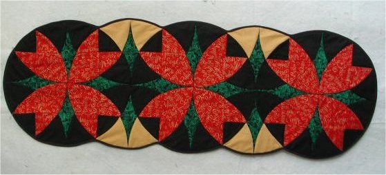
1. Christmas table runner. This came directly from the Sharlene Jorgenson book, as mentioned on the first page. Who would have thought that this is really Winding Ways?? But it really really is! I eventally plan to make matching placemats. Someday. Sometime. |
 |
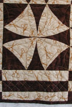
2. Winding Ways, brown. This came directly from the Nancy Elliott MacDonald book, as mentioned on the first page. The colors are mine, but the layout is from the book. It is the first and easiest Winding Ways project. From cutting to completion of the top, this was a fast project .. about 4 hours. I experimented with gold metallic thread for quilting. Here is a close-up of the quilting in addition to the quilt itself. |
 |
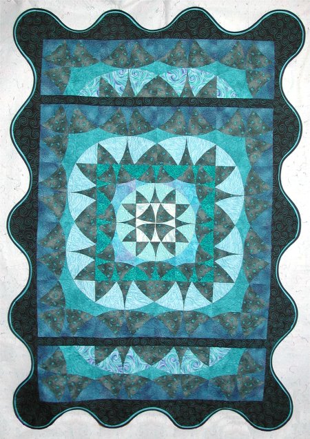
3. Winding Ways, blue. I love this quilt. Let me repeat .. I LOVE THIS QUILT. One of the projects in Nancy Elliott MacDonald's book features the same Winding Ways block done in concentric circles but different sizes (think of a round robin). It was very striking.
Well, I didn't have all the different sized templates needed for this quilt, but I did have a 6" acrylic set (from the Sharlene Jorgenson book) and my 9" ARDCO metal templates. I realized that I could make a 9-patch Winding Ways from the 6" templates, giving me an 18" center medallion. Two blocks using the 9" templates would give me a border with an 18" opening in the center! Voila! My own version of the concentric circles. The blue Winding Ways has 6" blocks in the middle, surrounded by 9" blocks. However, that gave me ANOTHER square quilt .... lordy, by this time I was really sick and tired of square wall hanging-sized quilts! After thinking about it, I decided I could enlarge it to a rectangle if I put a row of Winding Way blocks on the top & bottom. But putting them directly against the square medallion didn't look right, so I separated the top & bottom rows by a narrow plain black border. The entire resultant rectangle is surrounded by a wider black border. The effect I wanted was an explosion of in a monochromatic color theme. Then I put a deeply scalloped border with a contrast accent flap to futher emphasize the curvi-linear layout. I really, *really*, REALLY love this quilt. :-) |
|